
PROJECT CASE STUDY
CLIENT
Liftlab
INDUSTRY
Health & Wellness / Sports Nutrition
SCOPE
Brand Identity
TIMELINE
1 Week


Project Overview
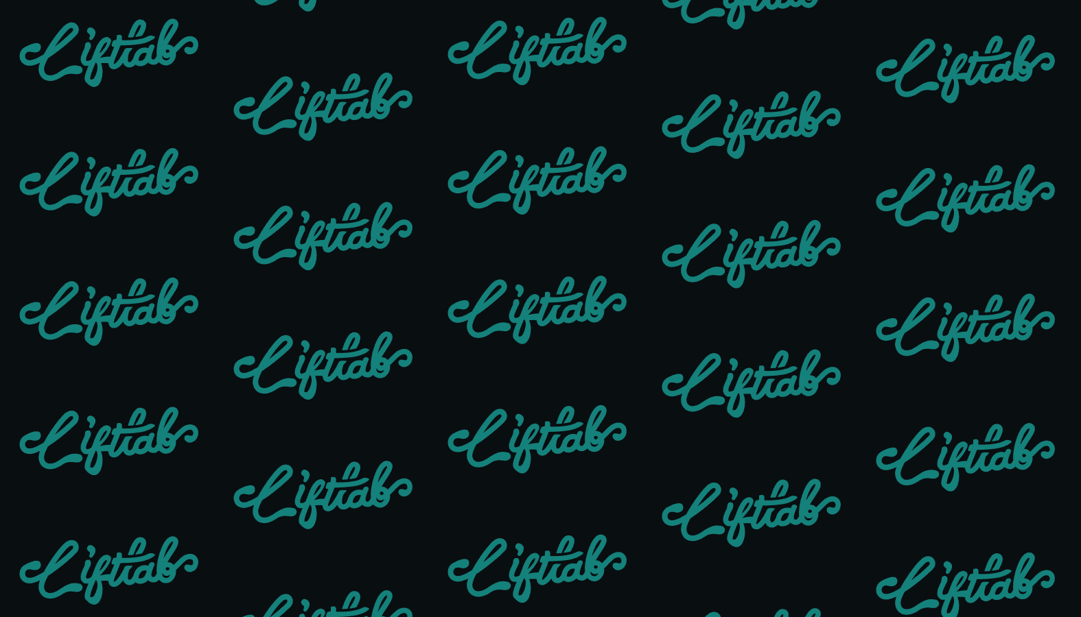
Liftlab is a sports-nutrition brand that reimagines creatine and recovery supplements as easy, enjoyable gummies — vegan, soy-free, and gluten-free, sold across a range of flavors under the line "Strength Made Simple." Sadora developed Liftlab's brand identity from the ground up, defining how the brand looks, feels, and shows up across product packaging, marketing, and merchandise. The identity system covers a custom script logotype with its full set of variations (primary, monochrome, and on light and dark backgrounds), a signature color palette anchored on Light Sea Green (#20B2AA), a repeating brand pattern, and a wide collateral suite — multi-flavor product packaging, social and ad creative ("Boost Your Power," "Strength Made Simple," the energy/battery metaphor), and branded merchandise mockups like tote bags and water bottles. The result is a complete, ready-to-apply toolkit that keeps Liftlab consistent and recognizable everywhere it appears.
Challenge & Approach
The supplement and creatine category is visually crowded and almost uniformly aggressive — black backgrounds, harsh neons, sharp edges, and a hyper-masculine "hardcore" tone. Liftlab's whole proposition is the opposite: creatine made simple, approachable, and genuinely pleasant to take. The branding challenge was to signal real performance credibility while staying friendly and fun enough to match a gummy product — without slipping into either clinical sterility or gym-bro cliché. Sadora's central move was a custom hand-lettered script logotype whose chewy, flexible, flowing strokes mirror the texture of the gummies themselves — the brand mark literally embodies the product. Paired with a fresh Light Sea Green palette, the identity stands apart from the category's dark-and-aggressive default and reads as energetic, clean, and welcoming. That tone carries through every touchpoint: packaging that color-codes flavors clearly, ad creative that pairs athletic energy with simple, confident messaging, and a flexible logo and pattern system that scales from a gummy jar to a tote bag. The outcome is a distinctive, cohesive brand that makes a performance supplement feel as approachable as its format.
